A warm and welcoming brand identity for Bolton Family Hubs, designed to help families feel supported, connected and confident from their child's earliest years.
Challenge
Bolton Council was bringing together a wide network of family support services under a single Family Hubs programme. The challenge was to create a welcoming, inclusive brand that could unite multiple organisations while helping parents and carers easily recognise where to find trusted advice, activities and support. The identity needed to appeal to families from every background, balancing professionalism with warmth and accessibility.
Solution
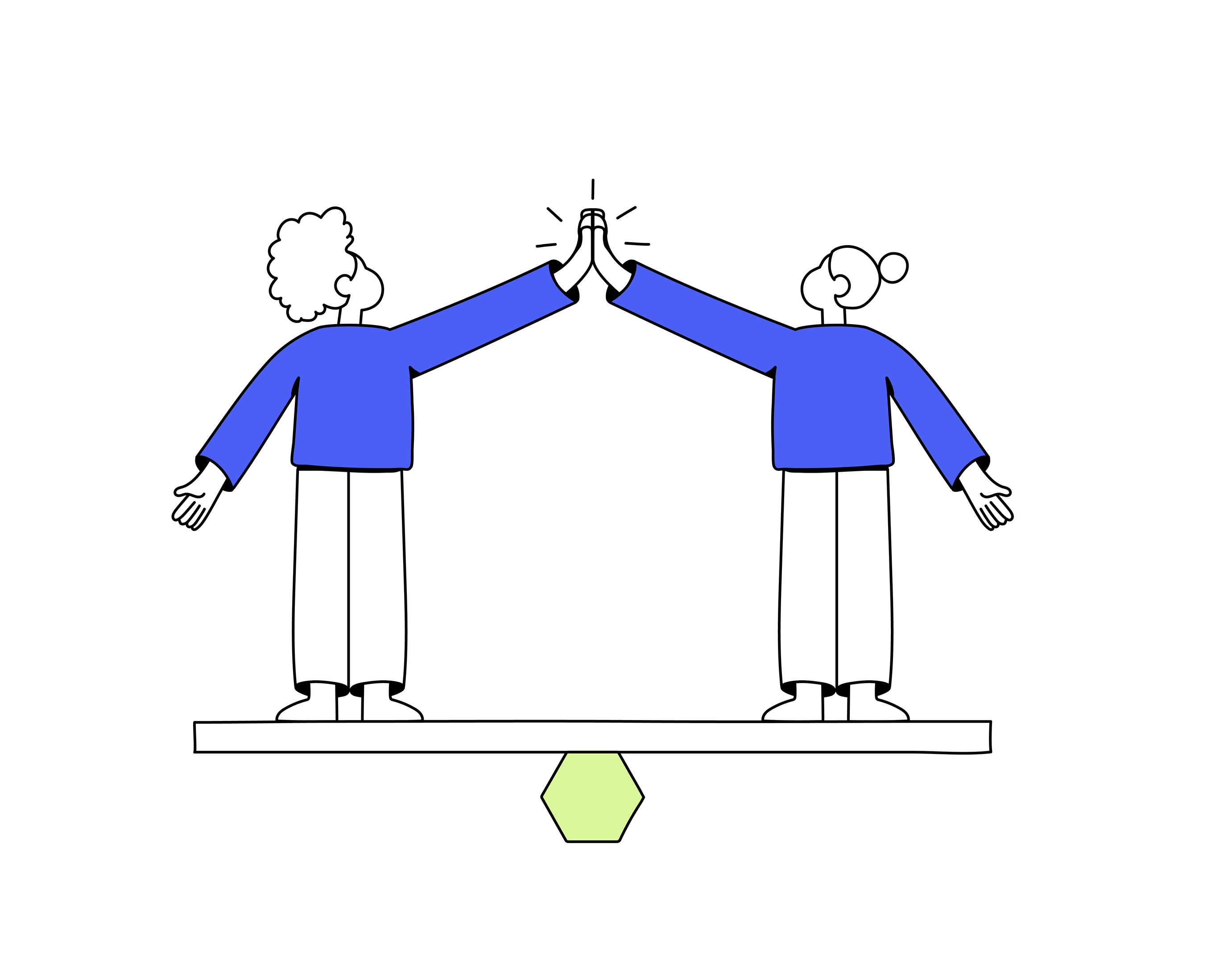
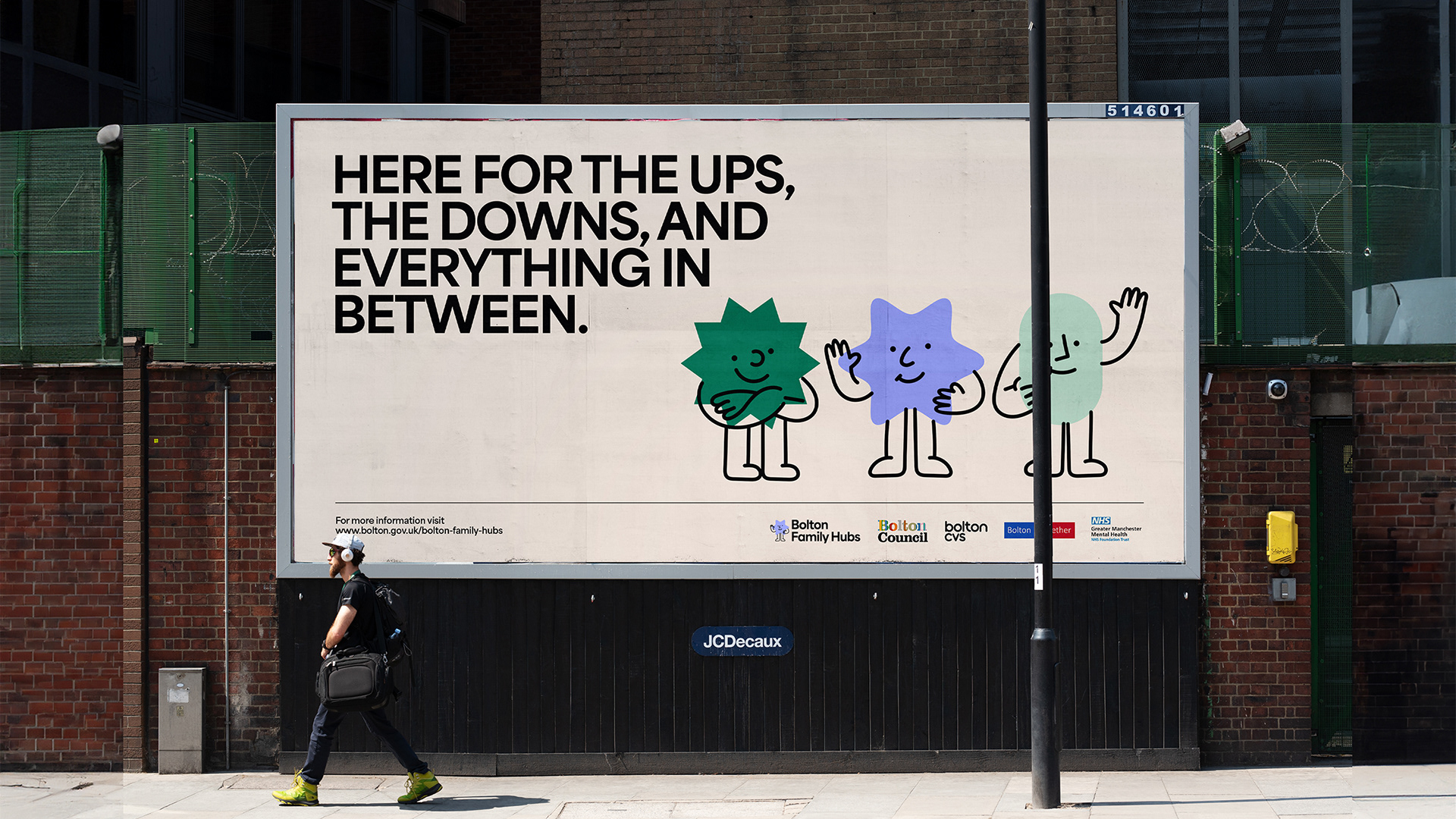
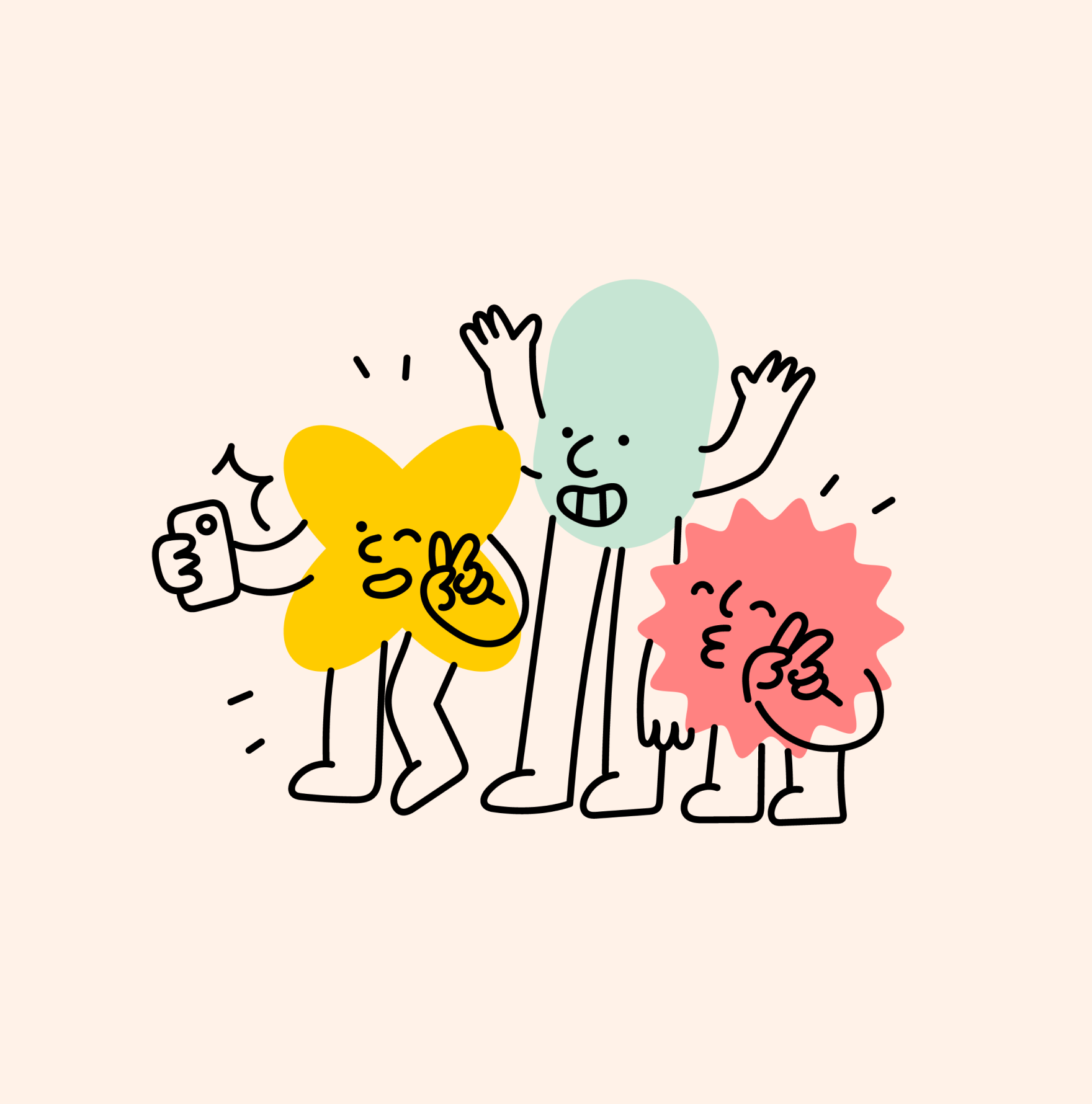
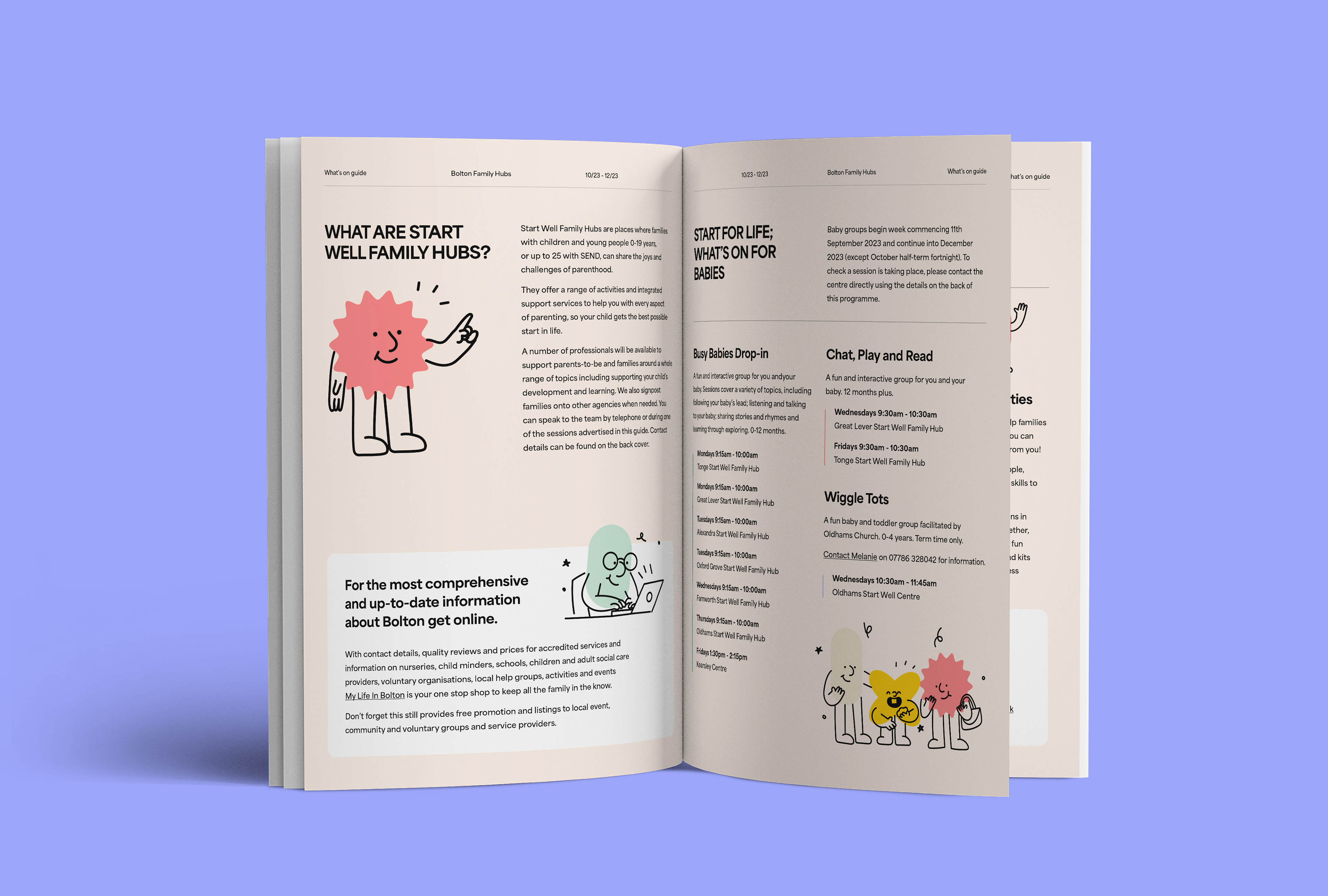
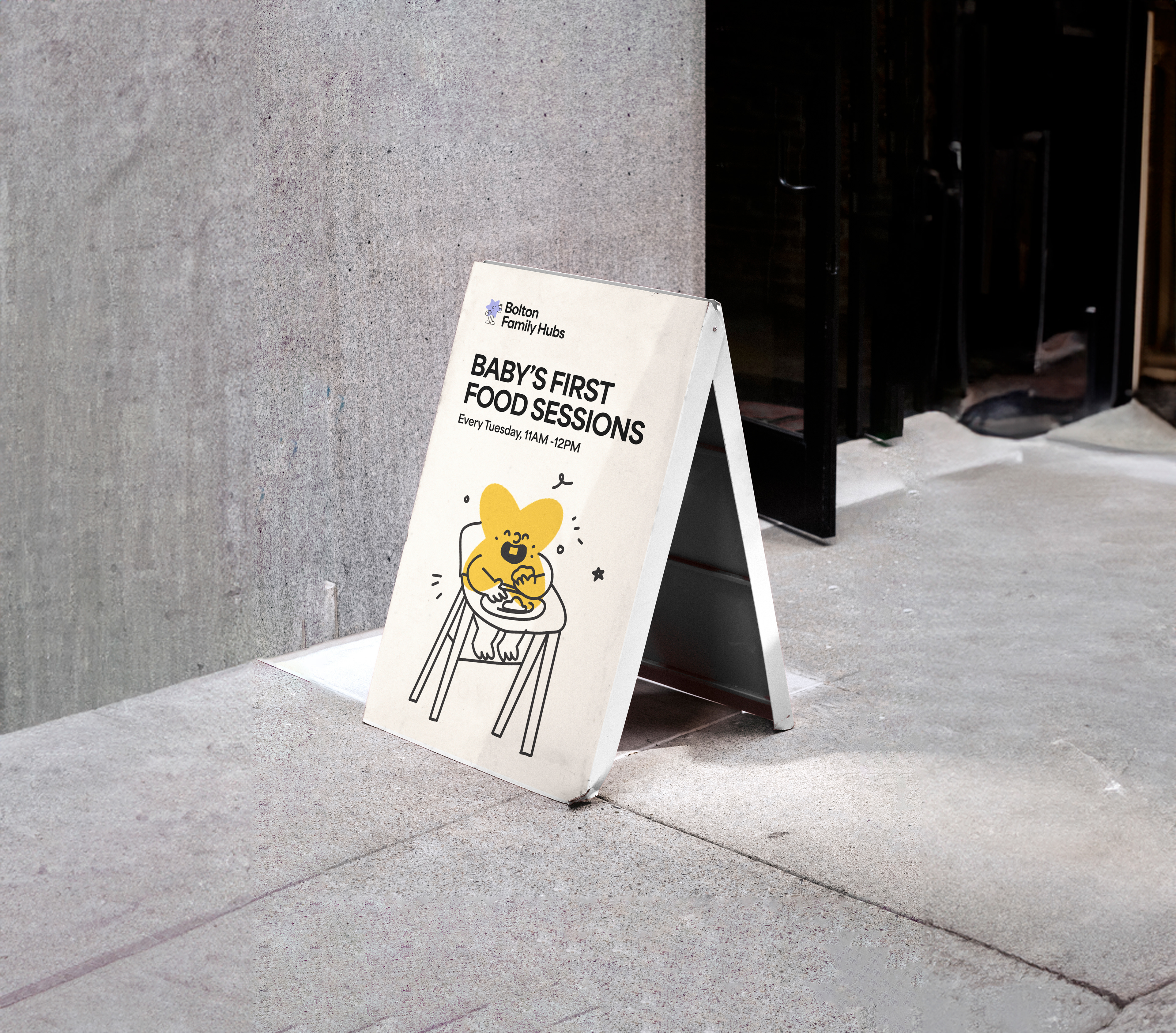
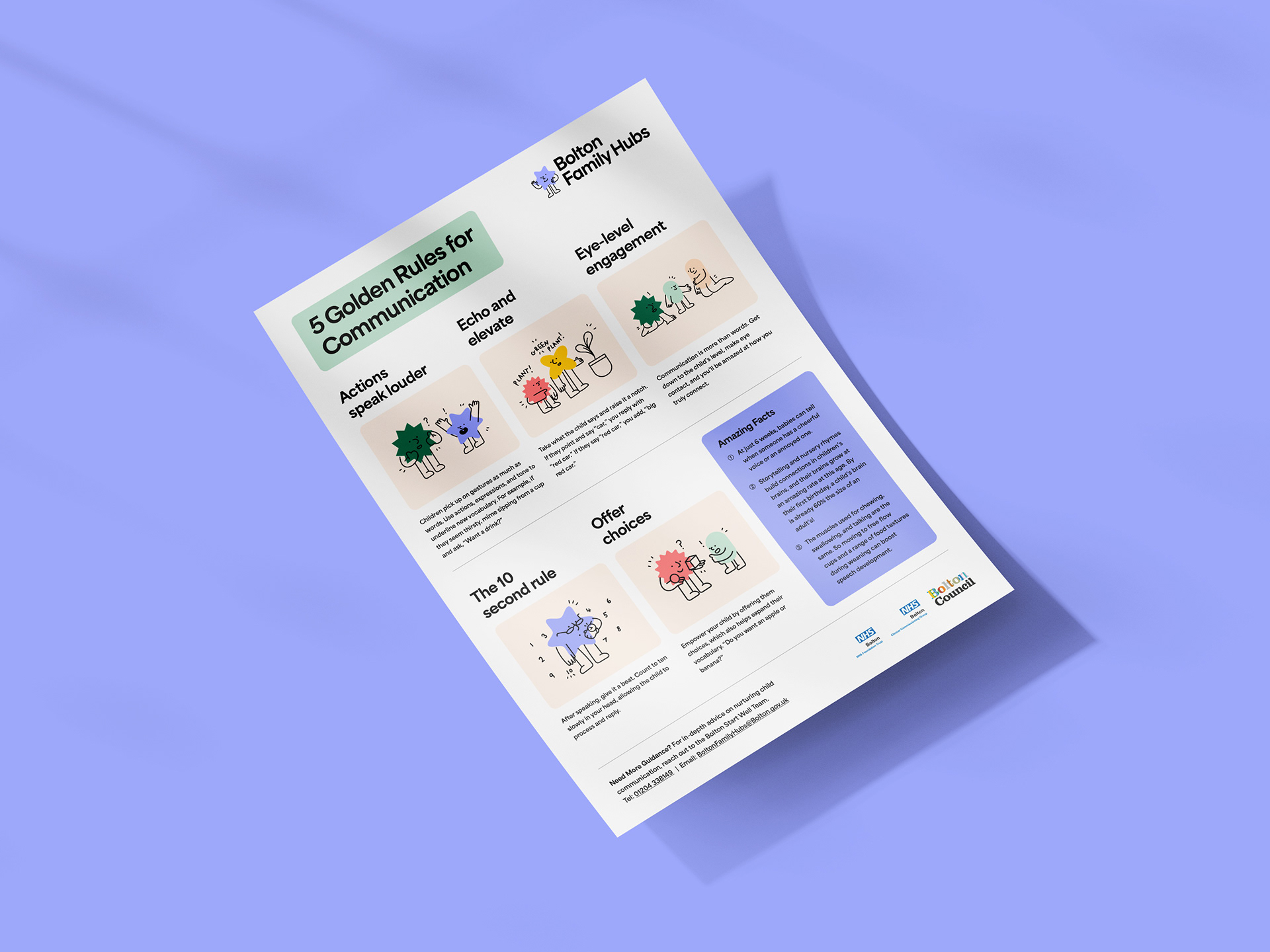
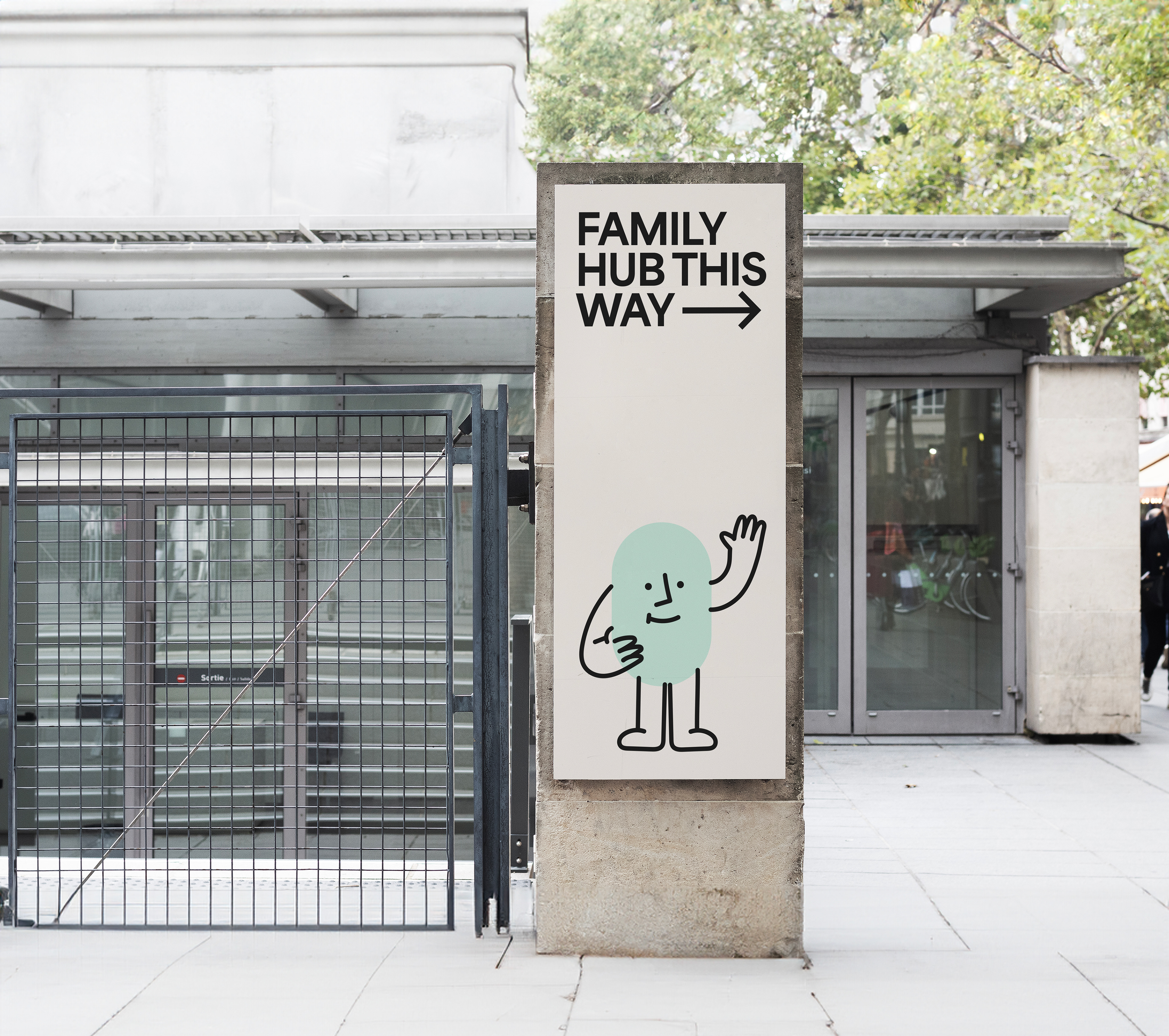
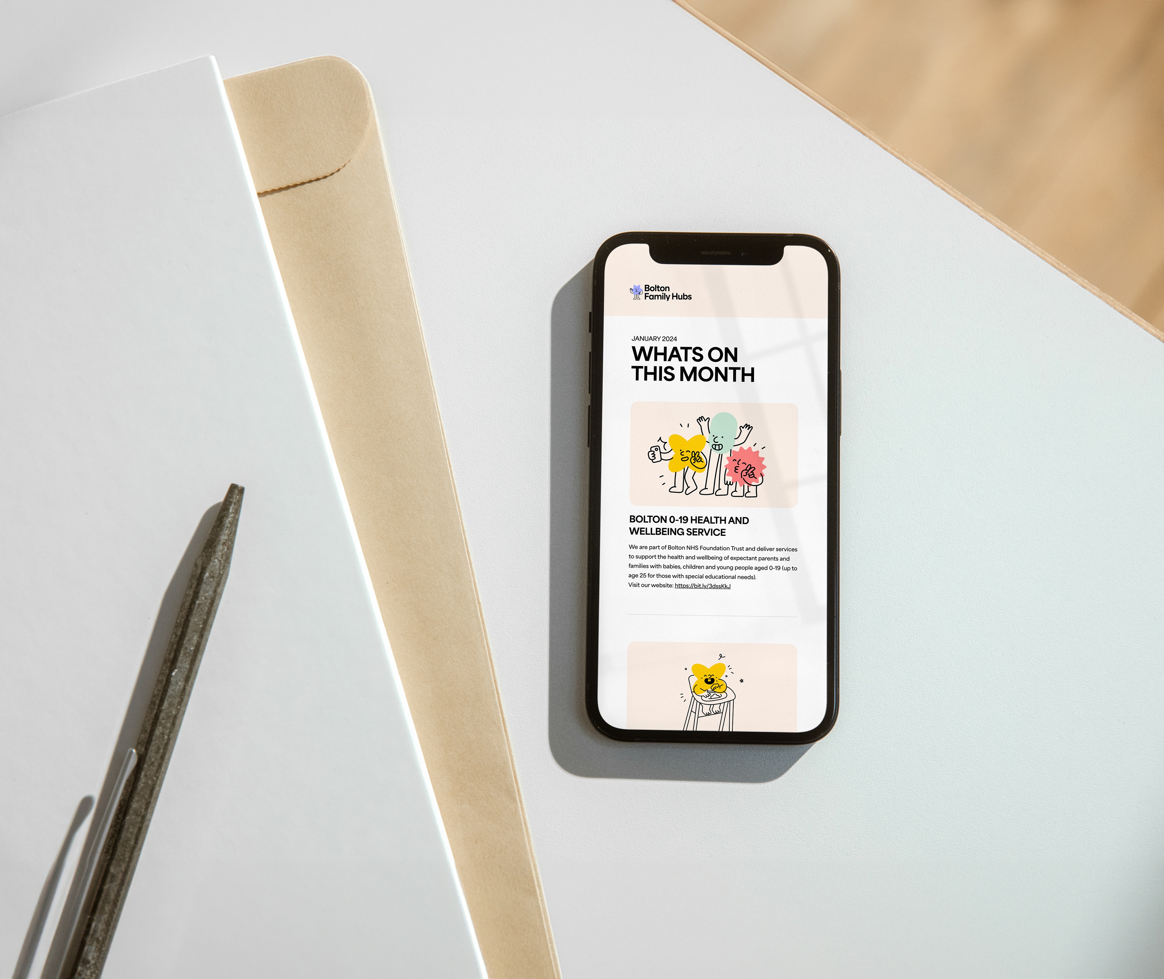
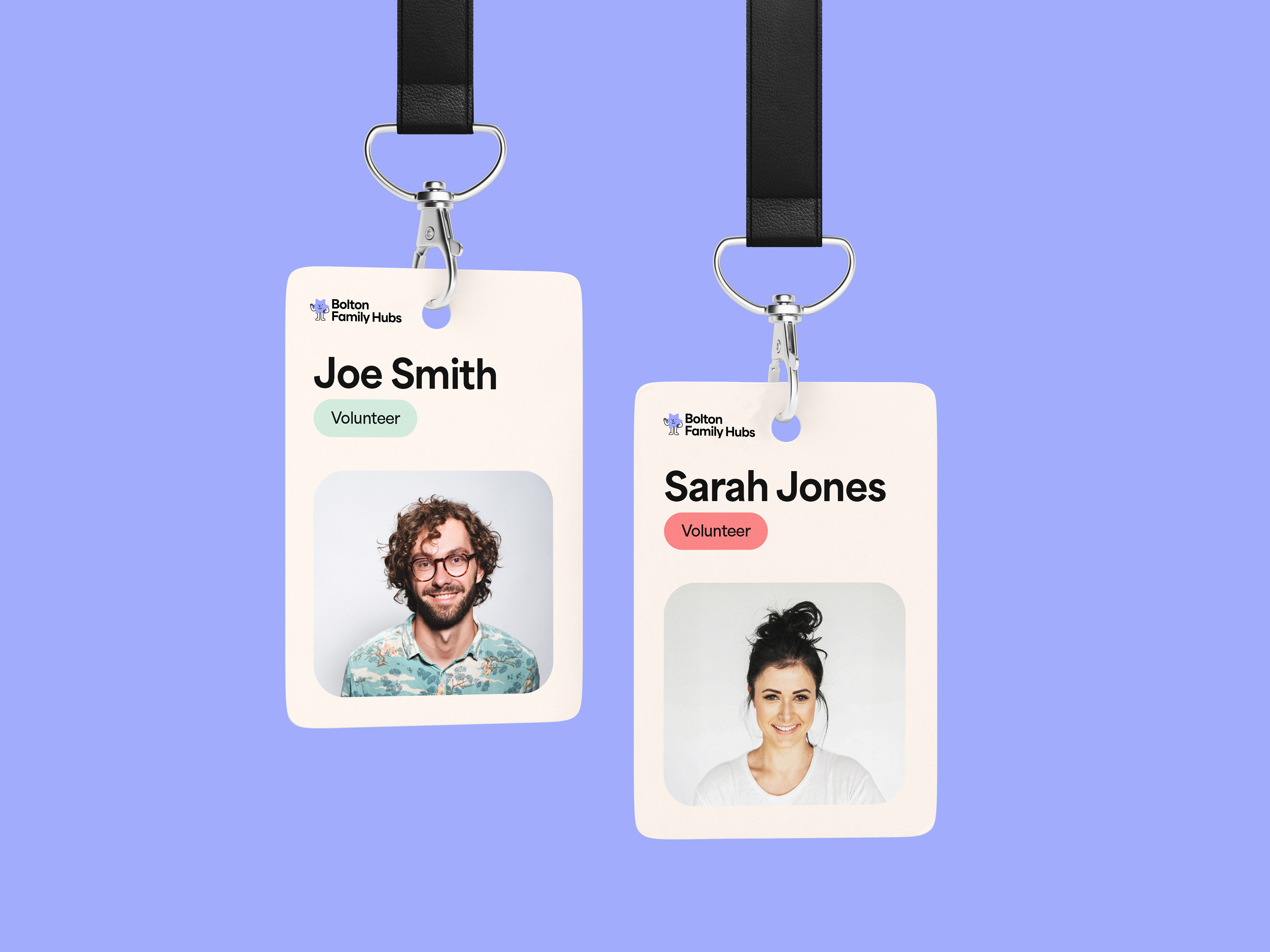
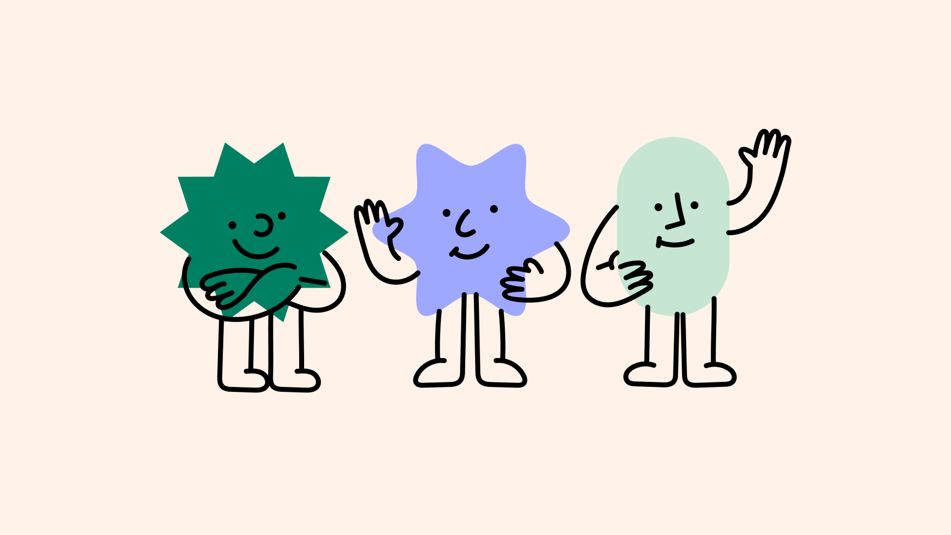
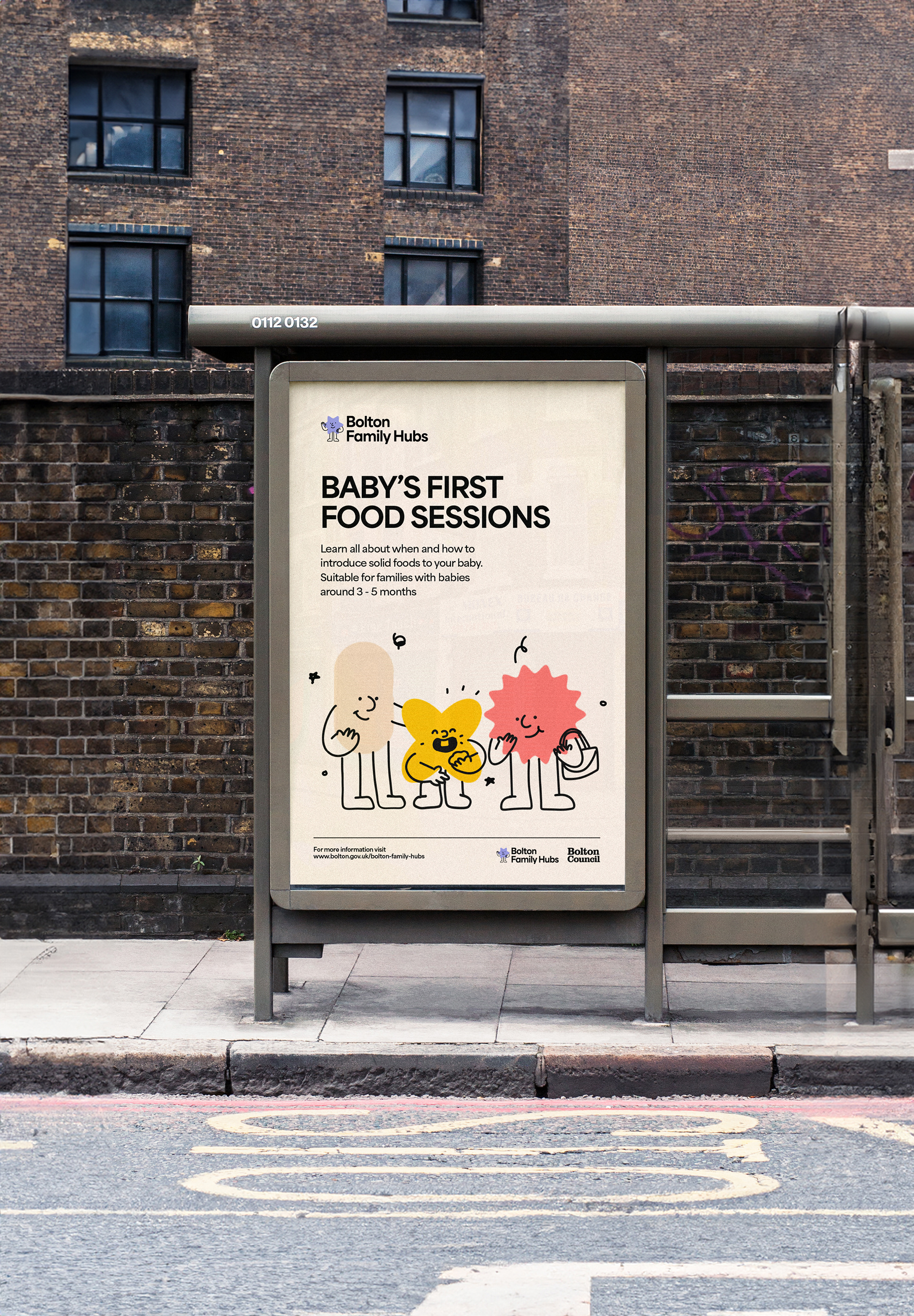
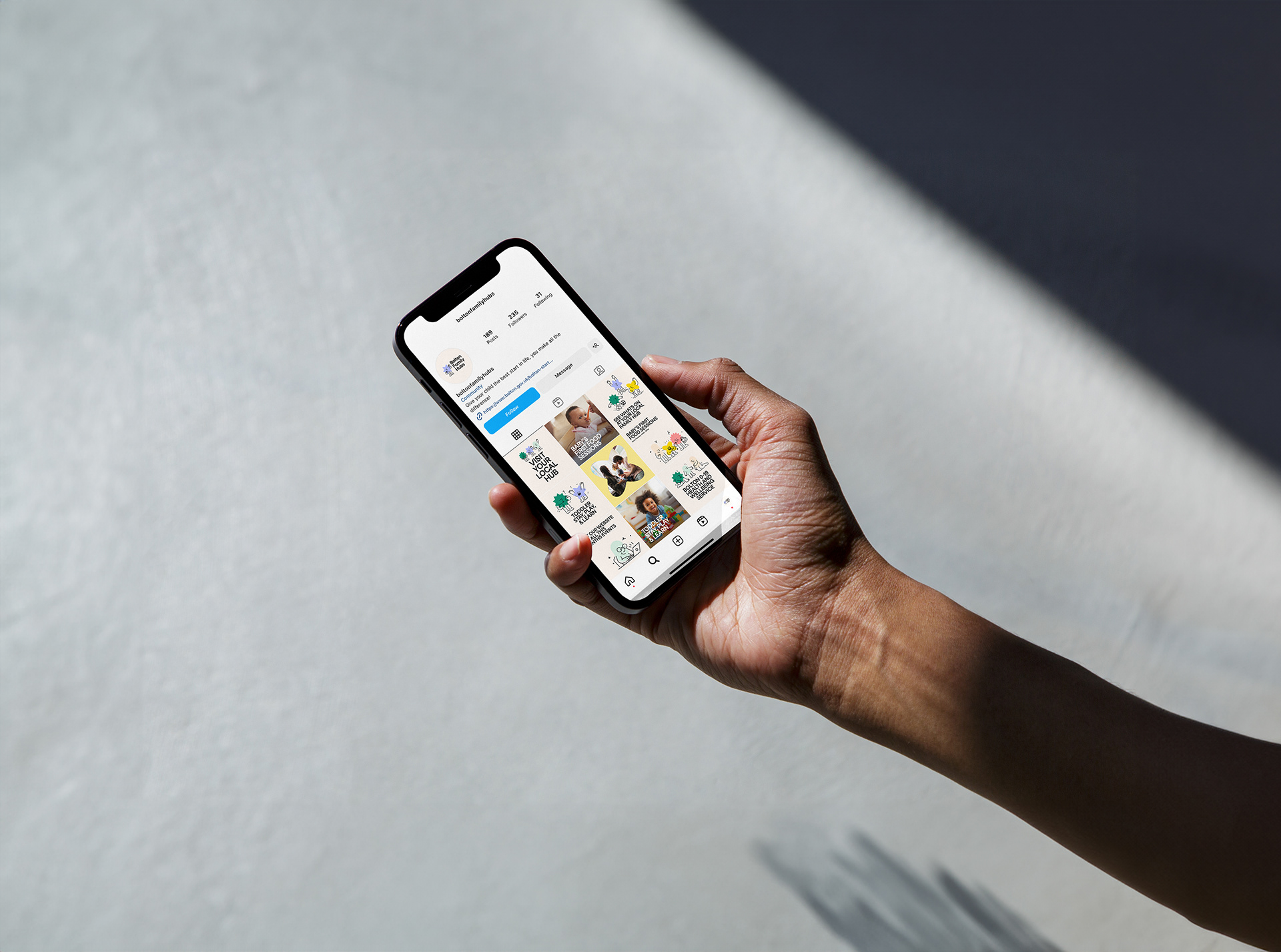
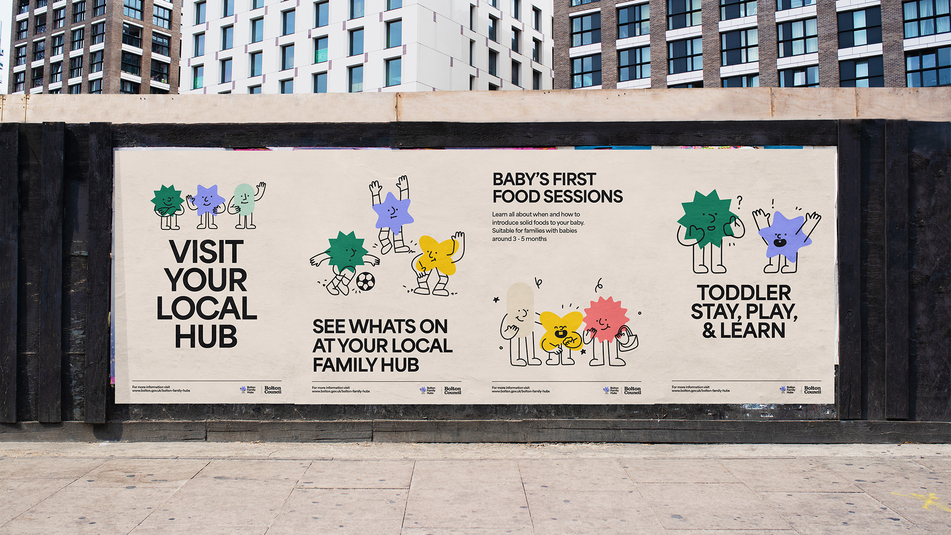
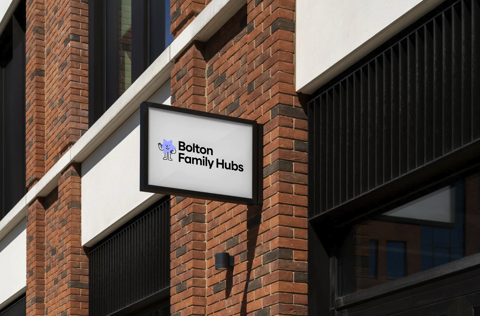
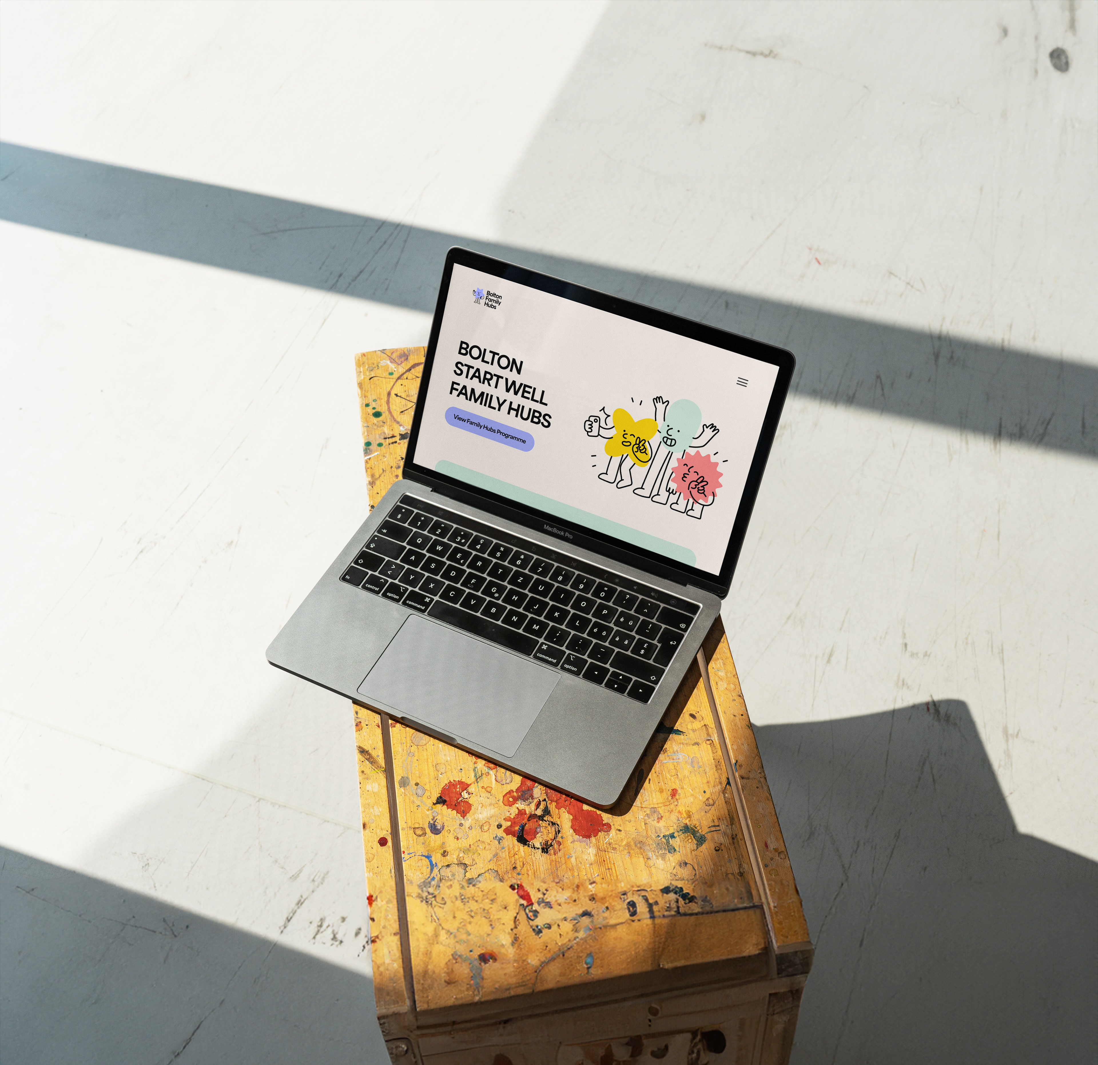
I led the development of a playful yet purposeful visual identity inspired by the diversity of Bolton's communities. We created a flexible design system built around friendly characters, bold colours and simple graphic forms that could adapt across signage, printed materials, digital communications and community spaces. Every element was designed to feel welcoming, reassuring and easy to navigate, helping transform a network of services into a single, recognisable brand that families could trust.
Result
The identity launched across Bolton's Family Hubs network, providing a consistent visual language for communications, environments and community engagement. By making the service feel approachable and recognisable, the brand helps families connect more easily with the support available, demonstrating how thoughtful design can remove barriers, build confidence and strengthen community services.