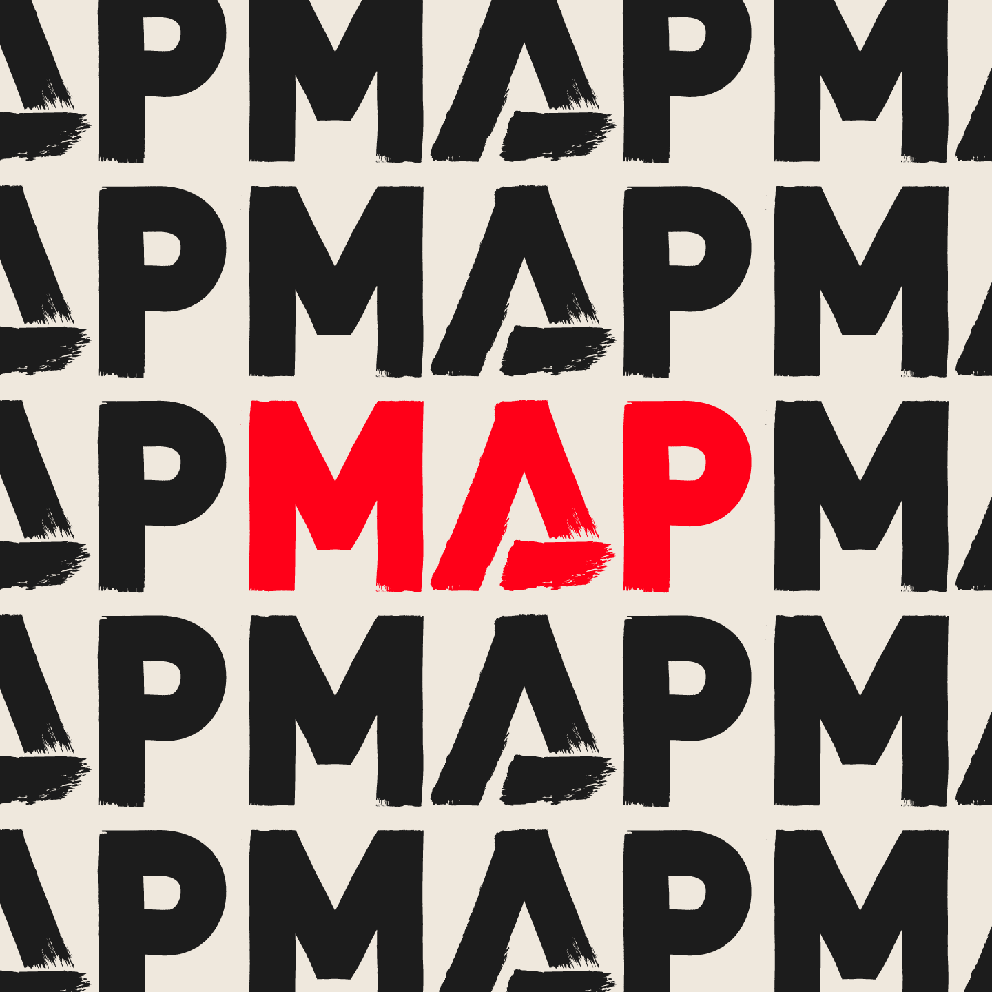
A thoughtful evolution of Medical Aid for Palestinians' iconic brand, balancing heritage and trust with a modern visual system designed for humanitarian communications.
Challenge
Medical Aid for Palestinians (MAP) needed to evolve its visual identity for a digital-first world while protecting the trust and recognition it had built over more than 40 years. The challenge was to modernise one of the charity sector's most established humanitarian brands without losing the heritage, credibility and emotional connection that makes it so meaningful to staff, supporters and the communities it serves.
Solution
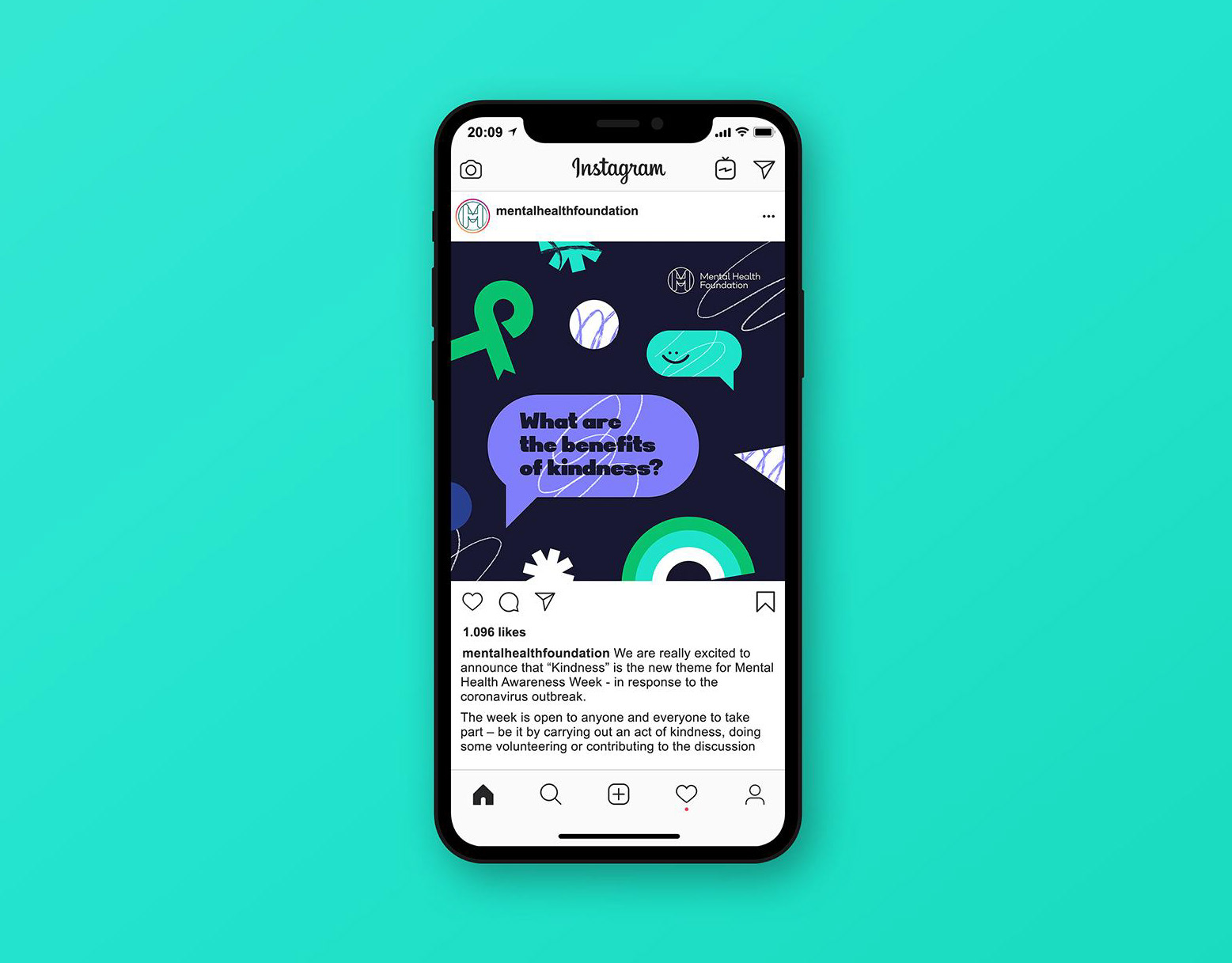
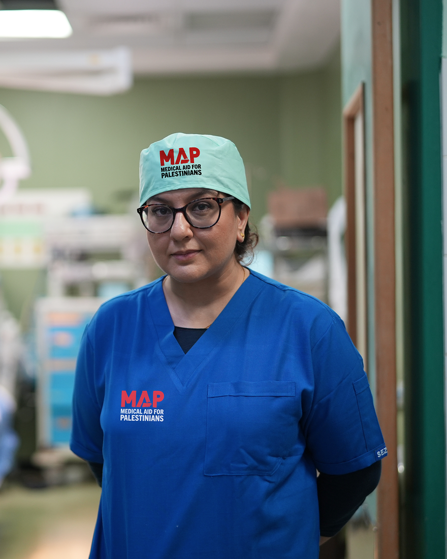
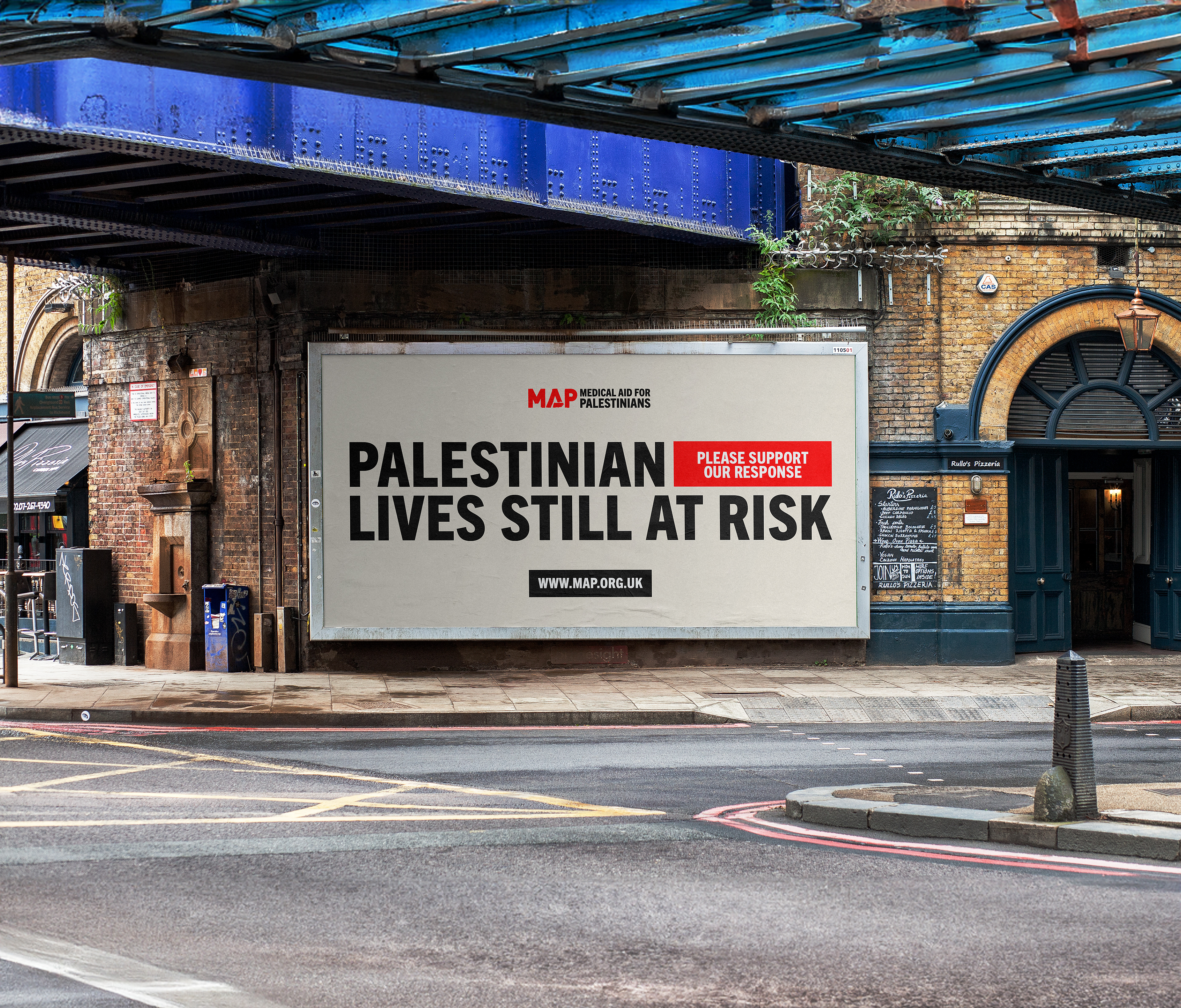
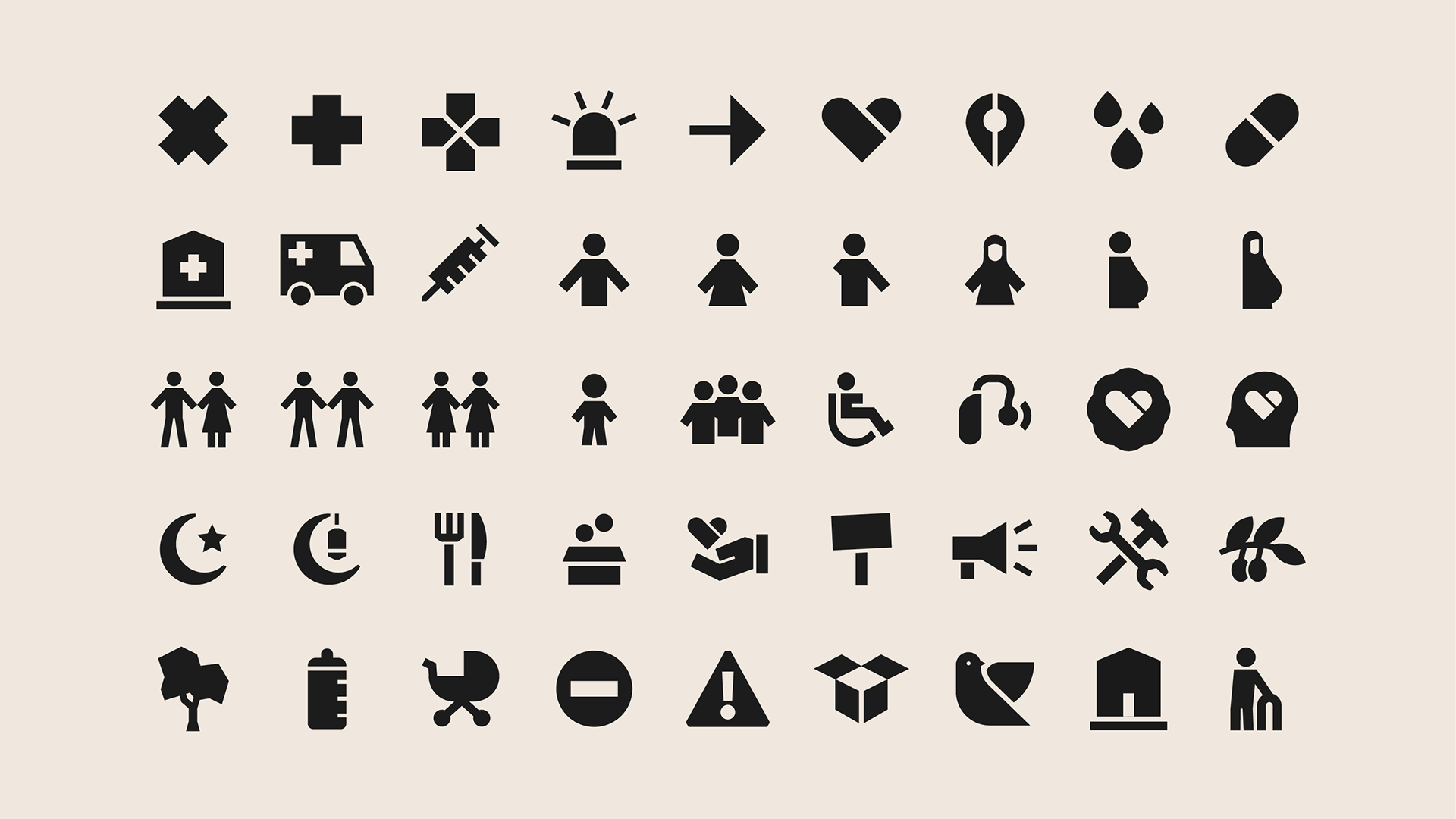
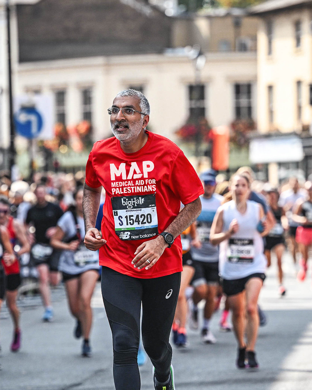
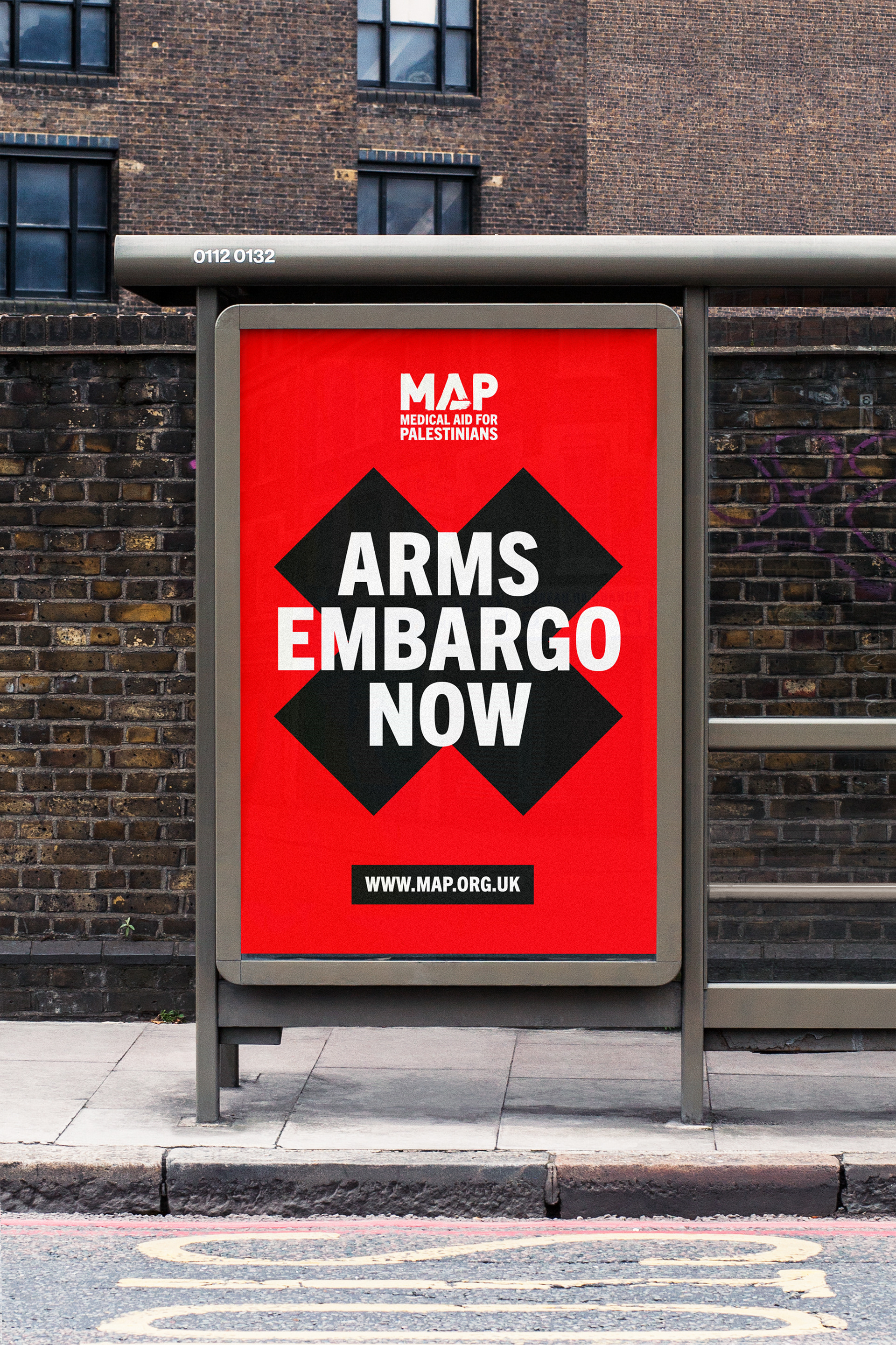
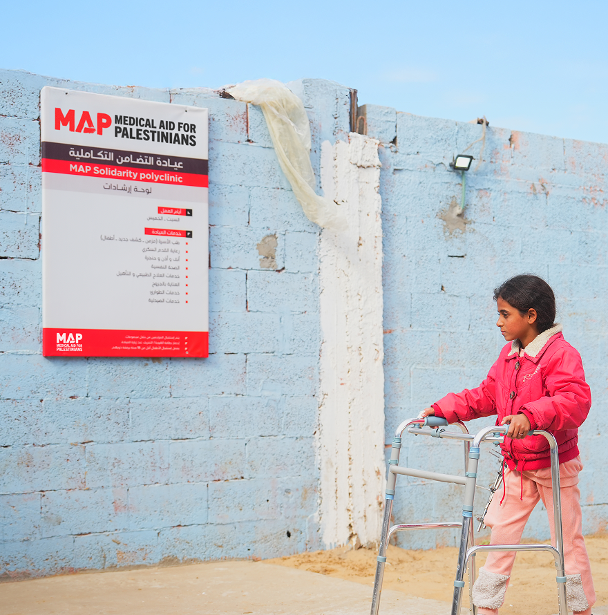
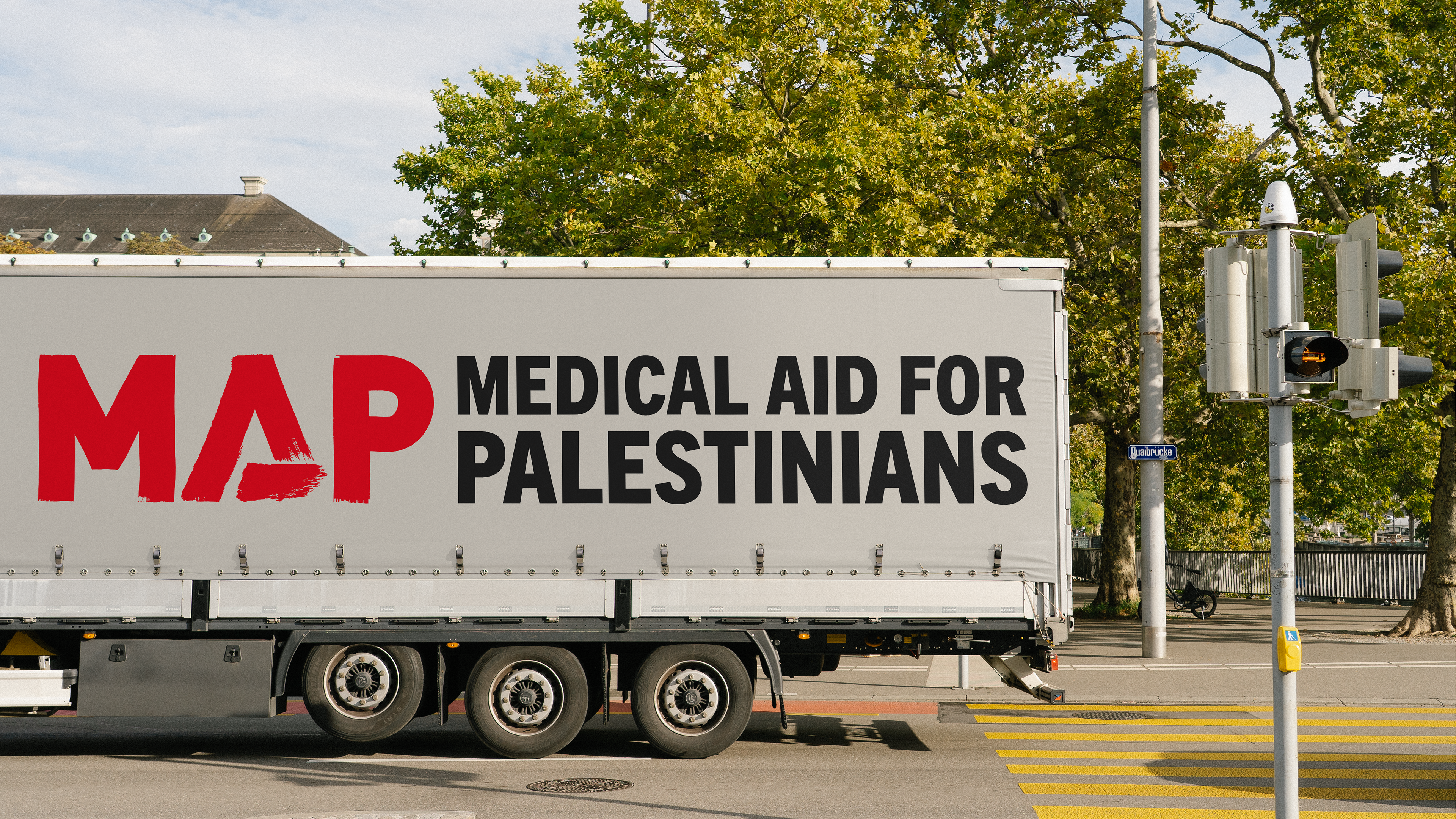
I led the evolution of the brand, refining the iconic wordmark and developing a cohesive visual identity rooted in Palestinian culture and place. Inspired by traditional textiles, architecture and geometric forms, we created a flexible design system that included bespoke icons, an expanded colour palette and a suite of digital templates for campaigns, reports and social media. Every element was designed to balance clarity with character, helping MAP communicate consistently across everything from emergency appeals to advocacy campaigns while remaining unmistakably recognisable.
Result
The refreshed identity provides MAP with a modern, scalable brand system that supports every aspect of its communications, from frontline healthcare and fundraising to international advocacy. By carefully evolving rather than reinventing the brand, the project strengthened one of the humanitarian sector's most recognisable identities, demonstrating how thoughtful design can build trust, improve clarity and help organisations communicate with greater confidence during times of crisis.